Relaymind is a concept product that rethinks how founders reflect, journal, and make sense of their week. Instead of a blank page, the app guides users through structured prompts, pulls context from previous entries, and uses AI to surface patterns, blind spots, and decisions that need to be made. I designed Relaymind end-to-end — from product narrative and information architecture to UI, design system, and motion — with a focus on staying calm, focused, and non-gimmicky while still feeling distinctly “AI native.”
Services:
Product, UI/UX design
Product, UI/UX design
Client:
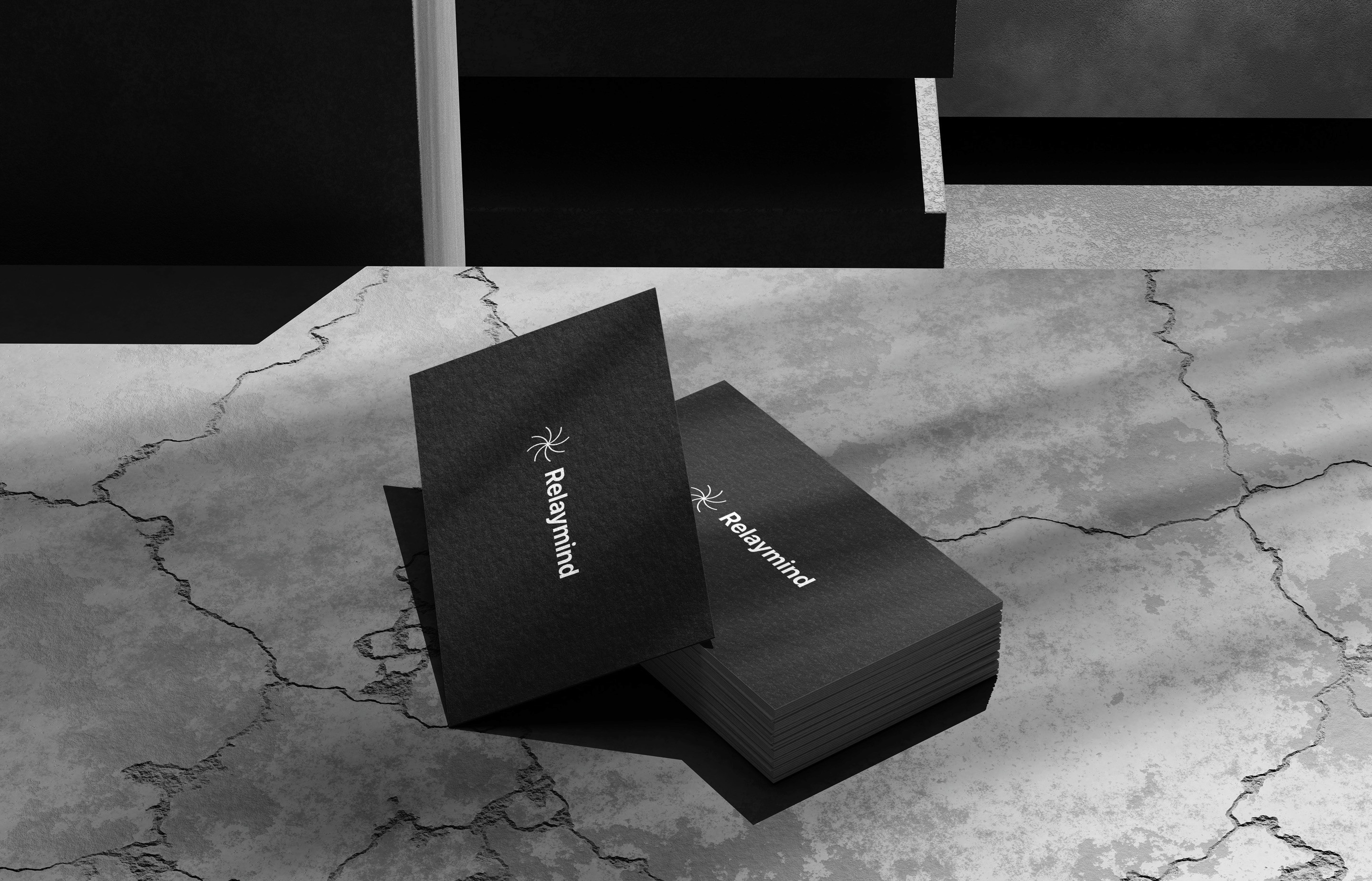
Relaymind
Relaymind
Year:
2025
2025
Problem
Most founders say they want to “reflect more,” but traditional journaling apps assume unlimited time and energy. In reality, people arrive tired at the end of the day with scattered notes across tools, no clear prompt, and no feedback loop. Important realizations stay buried in Notion pages, and weekly reviews turn into guilt rather than clarity.
Relaymind started as a simple question: what if reflection felt as structured and lightweight as checking analytics — but actually helped you think better, not just stare at more charts?
Product and Experience
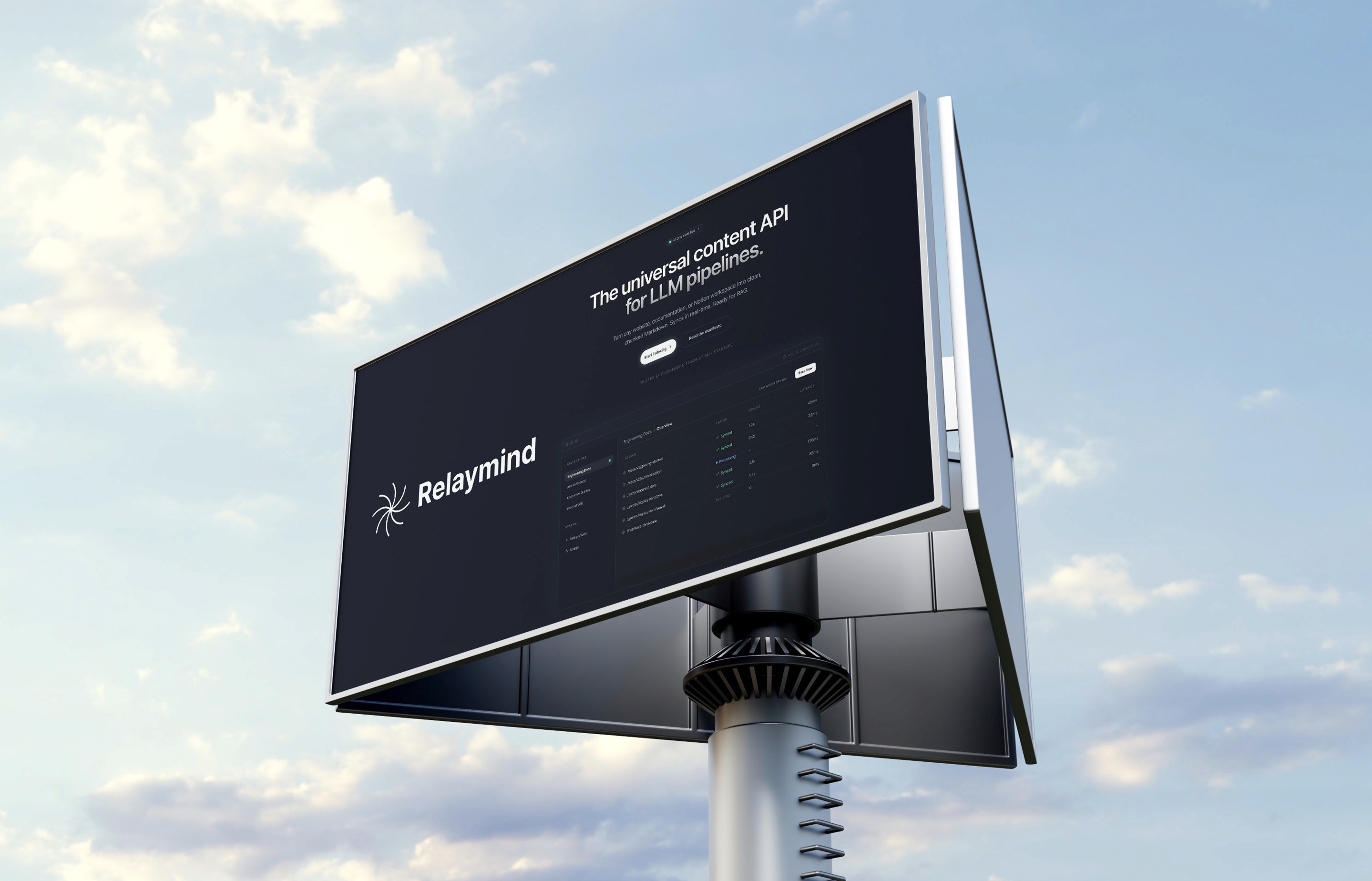
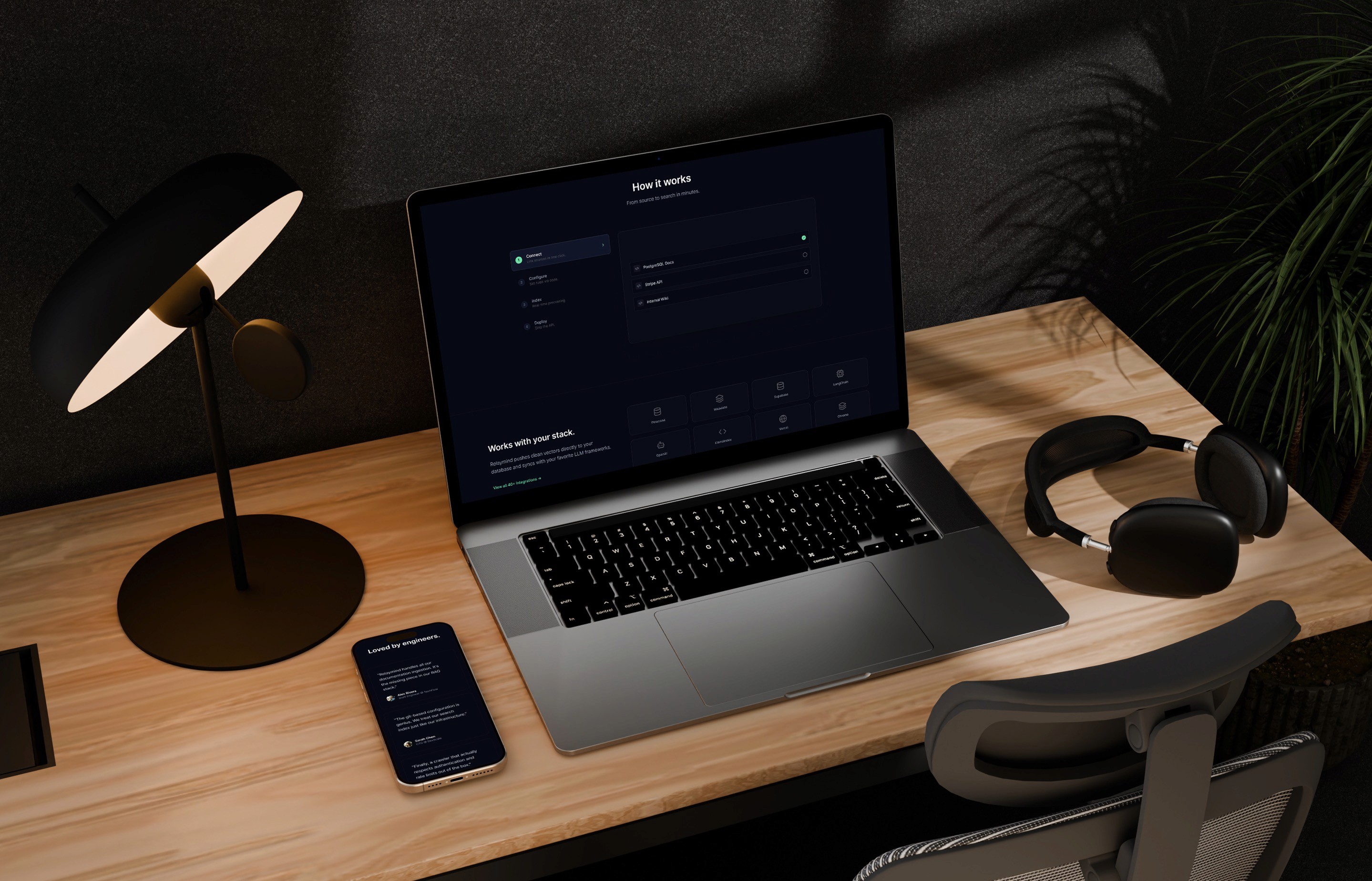
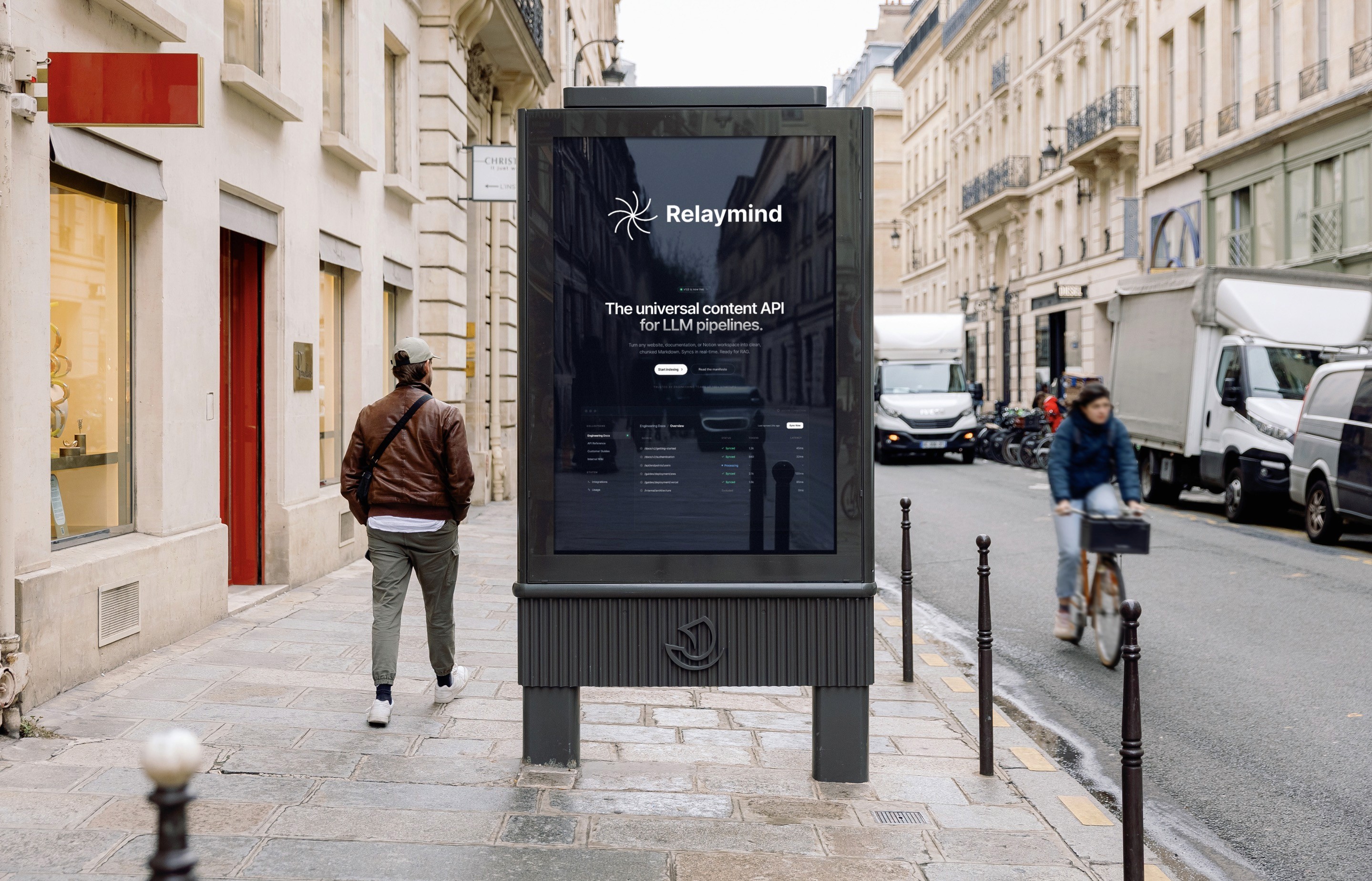
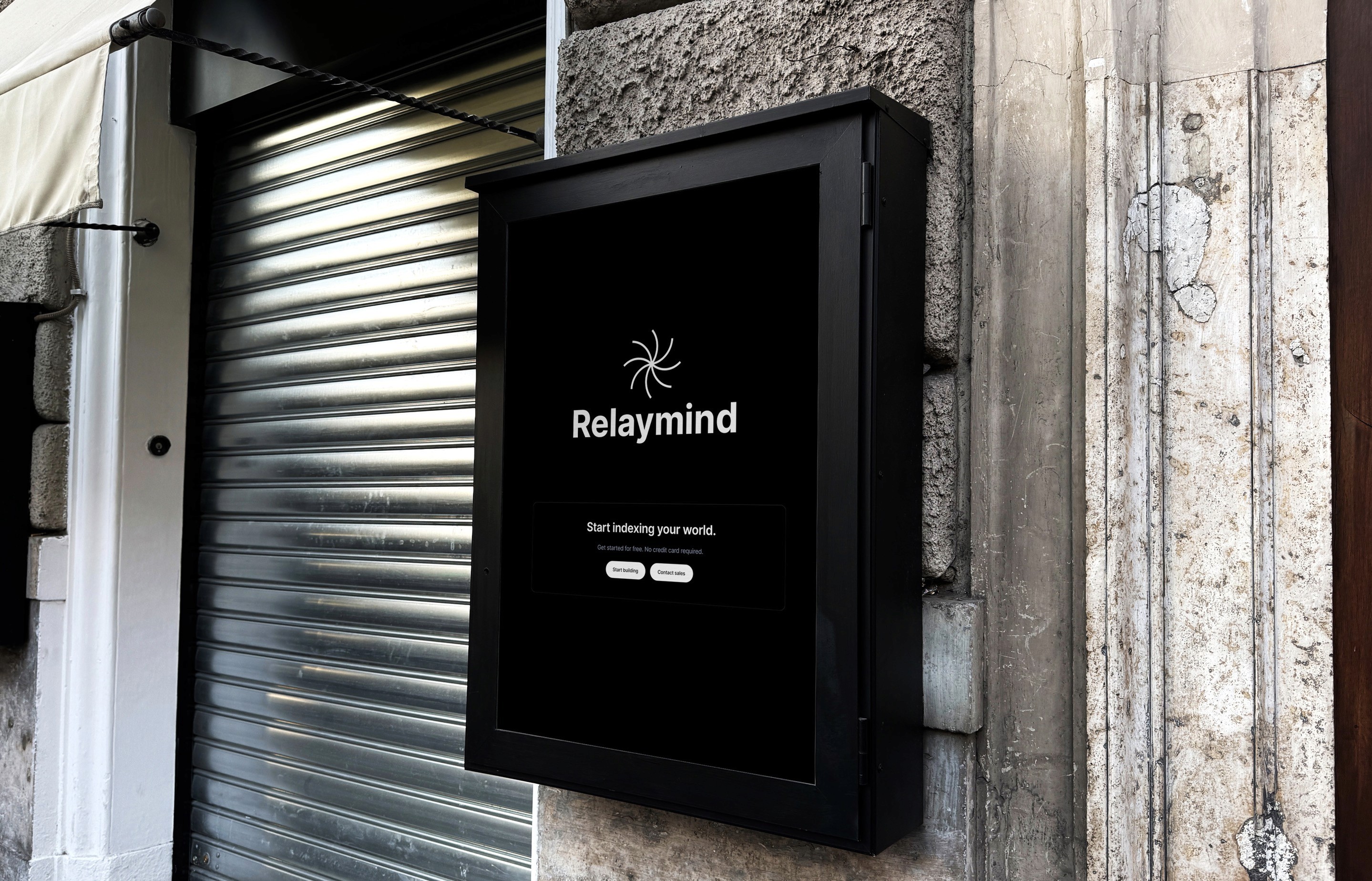
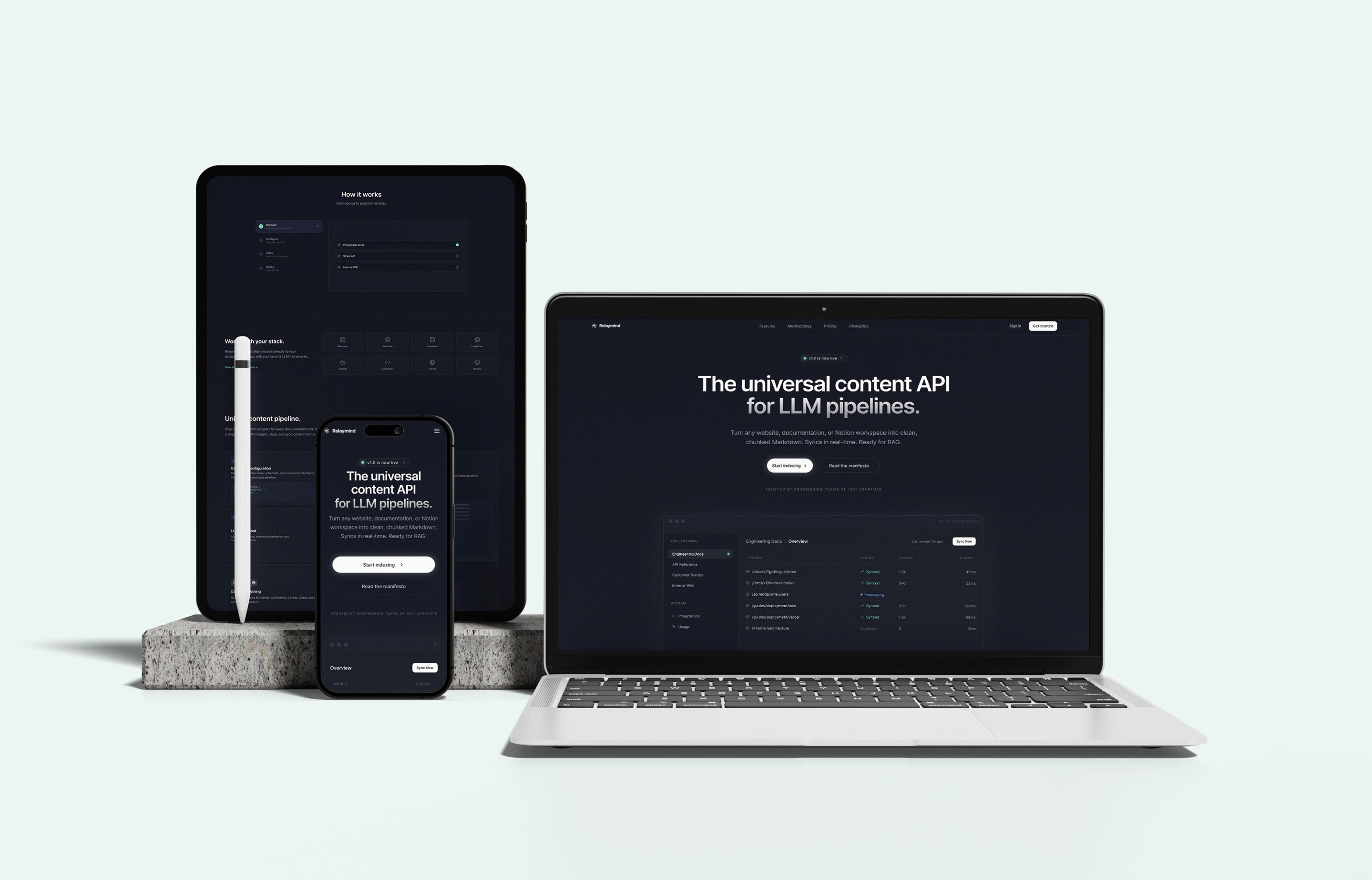
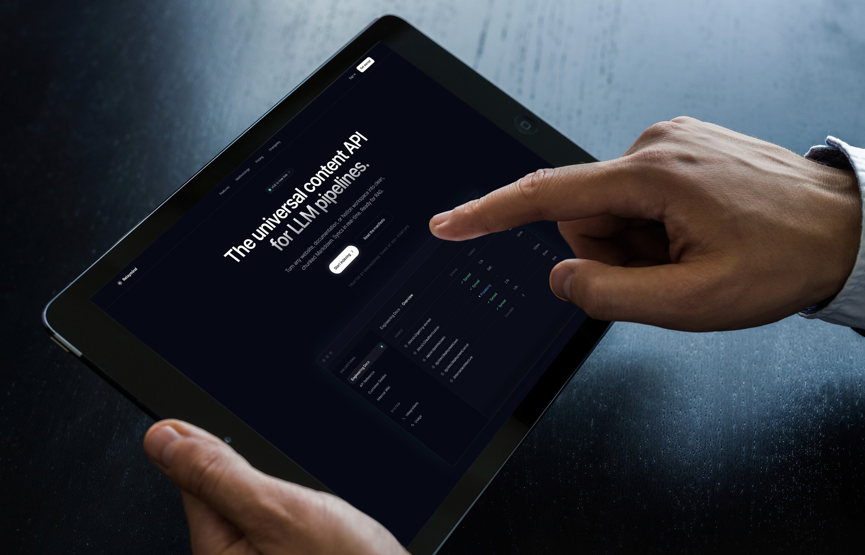
Relaymind is built around short, guided “relays” instead of open-ended entries. Each relay is a 5–10 minute flow: capture the key events of the day, tag wins and friction, and answer one or two targeted prompts. The interface keeps cognitive load low — large typography, clear progress, and just one decision per screen.
Under the surface, AI stitches entries together into weekly and monthly narratives. Instead of generic summaries, Relaymind highlights recurring themes, questions you keep avoiding, and decisions that are stuck. The UI uses a dark, cinematic theme with subtle motion: the AI feels like a quiet thinking partner, not a noisy chatbot. I used a token-based design system so the layout could scale from mobile-first capture to desktop review without redesigning every screen.
Outcomes and Learnings
Relaymind was never about shipping “yet another journaling app”; it was a way to explore what an AI-native thinking tool could look like when you design from first principles instead of chat bubbles. Prototyping and user walkthroughs showed that people wrote less, but got to insight faster — they cared more about seeing patterns than producing long entries.
This project clarified a few principles I now bring into other work: constrain input aggressively, design AI as a calm analyst rather than a personality, and always close the loop with clear next steps. Relaymind became a reference point for future client projects that needed AI to feel trustworthy, minimal, and deeply integrated into the product narrative, not layered on top.
Problem
Most founders say they want to “reflect more,” but traditional journaling apps assume unlimited time and energy. In reality, people arrive tired at the end of the day with scattered notes across tools, no clear prompt, and no feedback loop. Important realizations stay buried in Notion pages, and weekly reviews turn into guilt rather than clarity.
Relaymind started as a simple question: what if reflection felt as structured and lightweight as checking analytics — but actually helped you think better, not just stare at more charts?
Product and Experience
Relaymind is built around short, guided “relays” instead of open-ended entries. Each relay is a 5–10 minute flow: capture the key events of the day, tag wins and friction, and answer one or two targeted prompts. The interface keeps cognitive load low — large typography, clear progress, and just one decision per screen.
Under the surface, AI stitches entries together into weekly and monthly narratives. Instead of generic summaries, Relaymind highlights recurring themes, questions you keep avoiding, and decisions that are stuck. The UI uses a dark, cinematic theme with subtle motion: the AI feels like a quiet thinking partner, not a noisy chatbot. I used a token-based design system so the layout could scale from mobile-first capture to desktop review without redesigning every screen.
Outcomes and Learnings
Relaymind was never about shipping “yet another journaling app”; it was a way to explore what an AI-native thinking tool could look like when you design from first principles instead of chat bubbles. Prototyping and user walkthroughs showed that people wrote less, but got to insight faster — they cared more about seeing patterns than producing long entries.
This project clarified a few principles I now bring into other work: constrain input aggressively, design AI as a calm analyst rather than a personality, and always close the loop with clear next steps. Relaymind became a reference point for future client projects that needed AI to feel trustworthy, minimal, and deeply integrated into the product narrative, not layered on top.