Orbit is a concept product that treats time as a limited resource, not an infinite grid of meeting slots. Instead of scattering tasks across tools and calendars, Orbit pulls your commitments into a single, opinionated interface that shows one “focus orbit” at a time. The system learns which work actually moves the needle, then rearranges your week around those blocks. I designed Orbit end-to-end — product framing, flows, and interface — with the goal of making a complex scheduling engine feel simple, predictable, and calm, especially on dark UI.
Services:
Product, UI/UX
Product, UI/UX
Client:
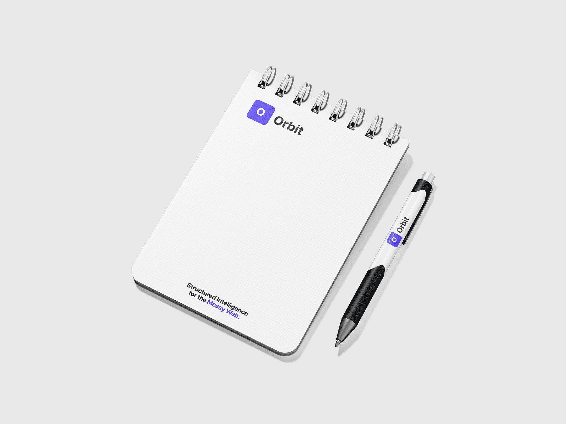
Orbit
Orbit
Year:
2025
2025
Problem
Most productivity stacks look impressive in screenshots and chaotic in real life. Founders juggle a calendar app, task manager, CRM, and half a dozen docs, but none of them agree on what today should actually look like. Calendars get filled with reactive meetings, tasks live in endless backlogs, and “deep work” becomes something you schedule aspirationally and then cancel.
Orbit was my attempt to answer a simple question: what would your day look like if a tool understood both your constraints and your priorities, and ruthlessly protected the time you actually need to think?
Product and Experience
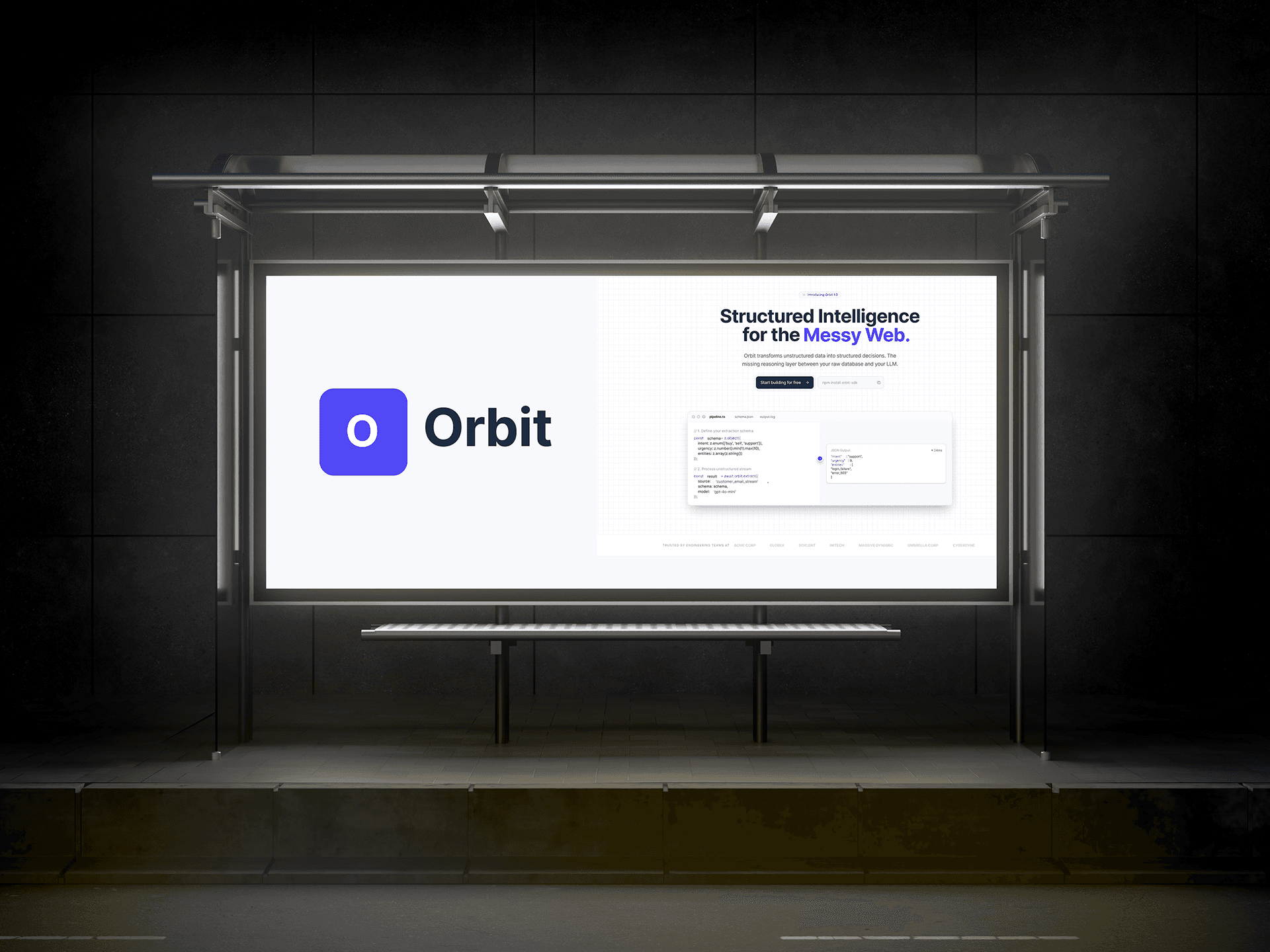
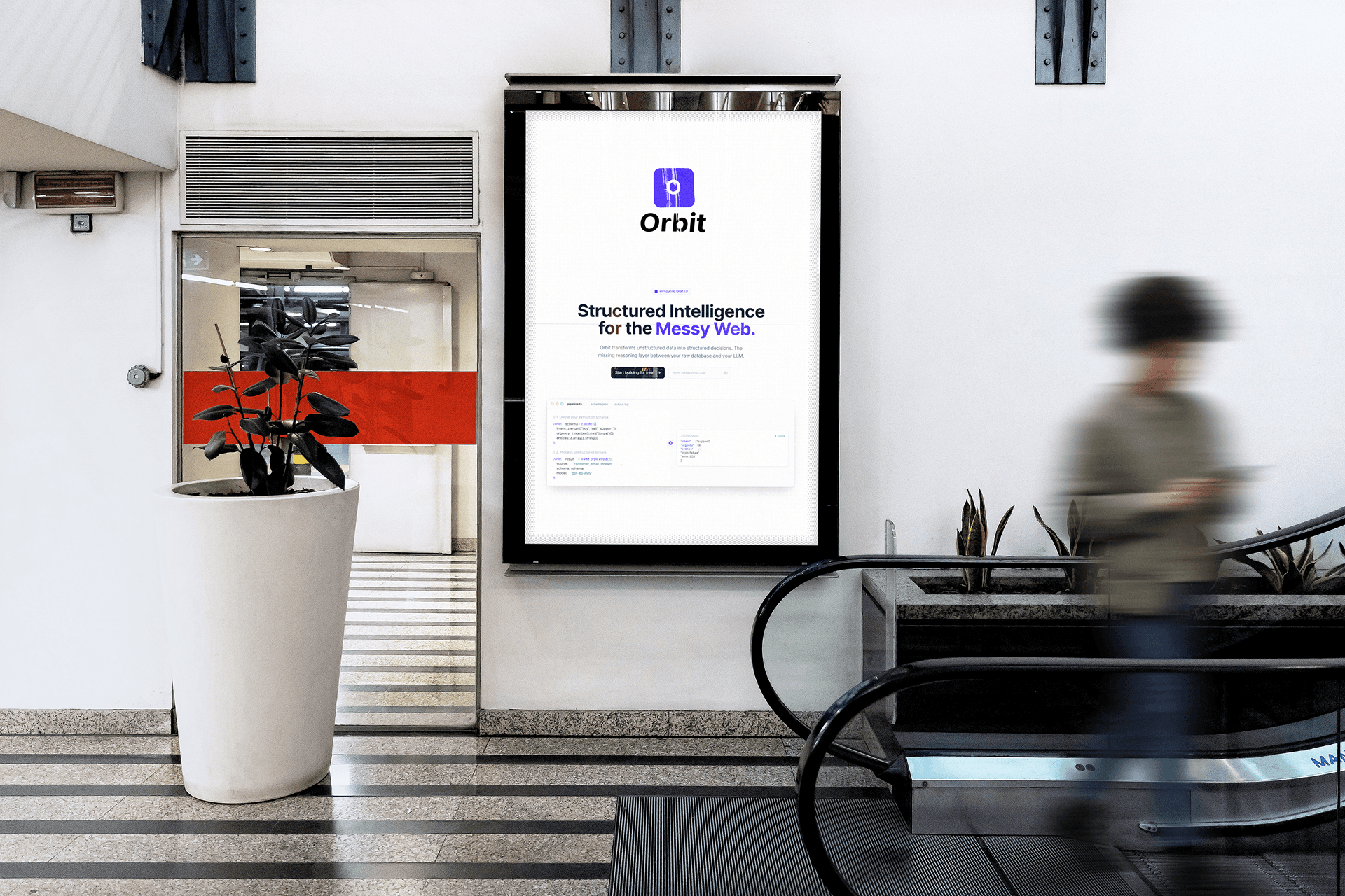
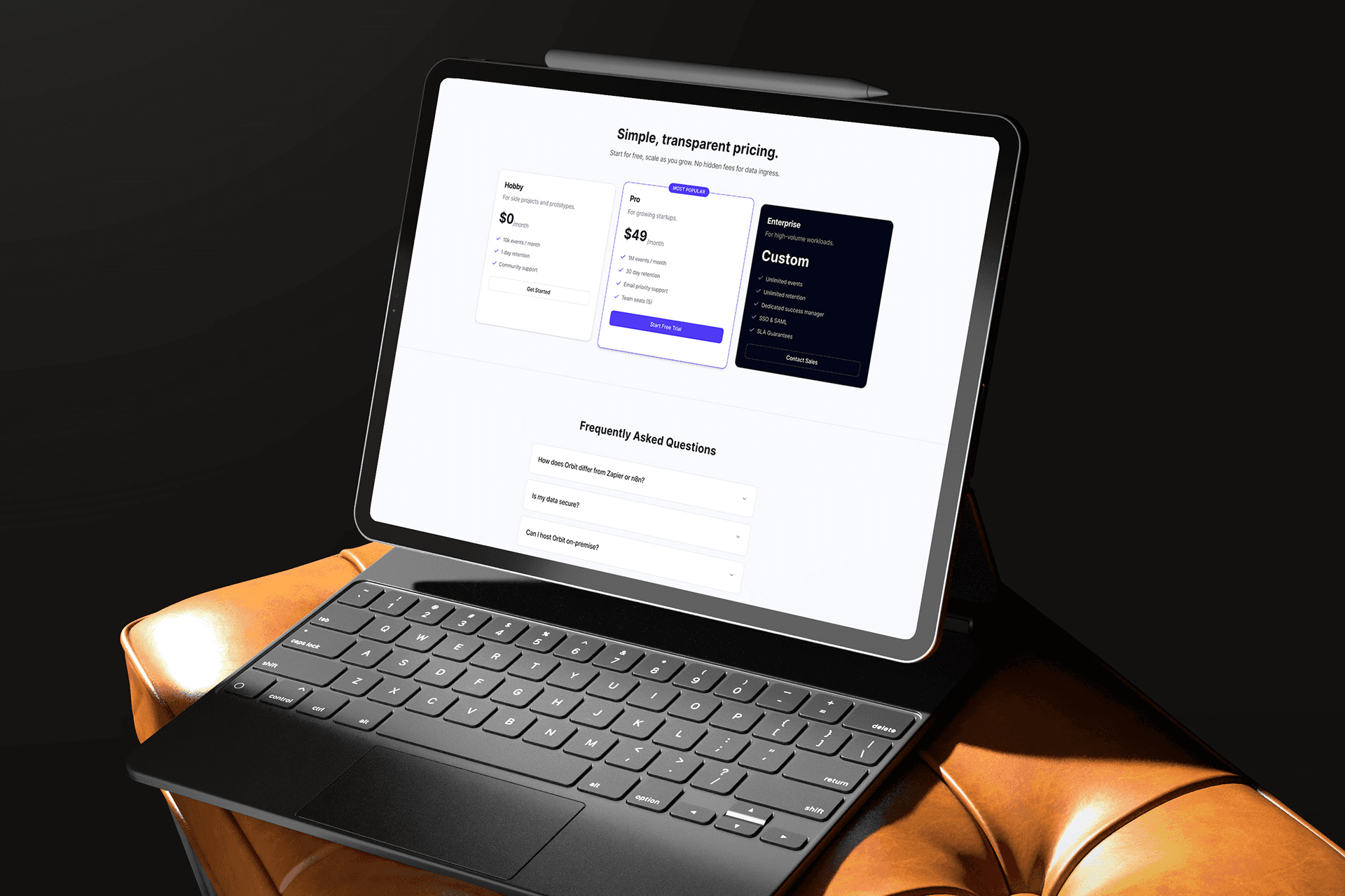
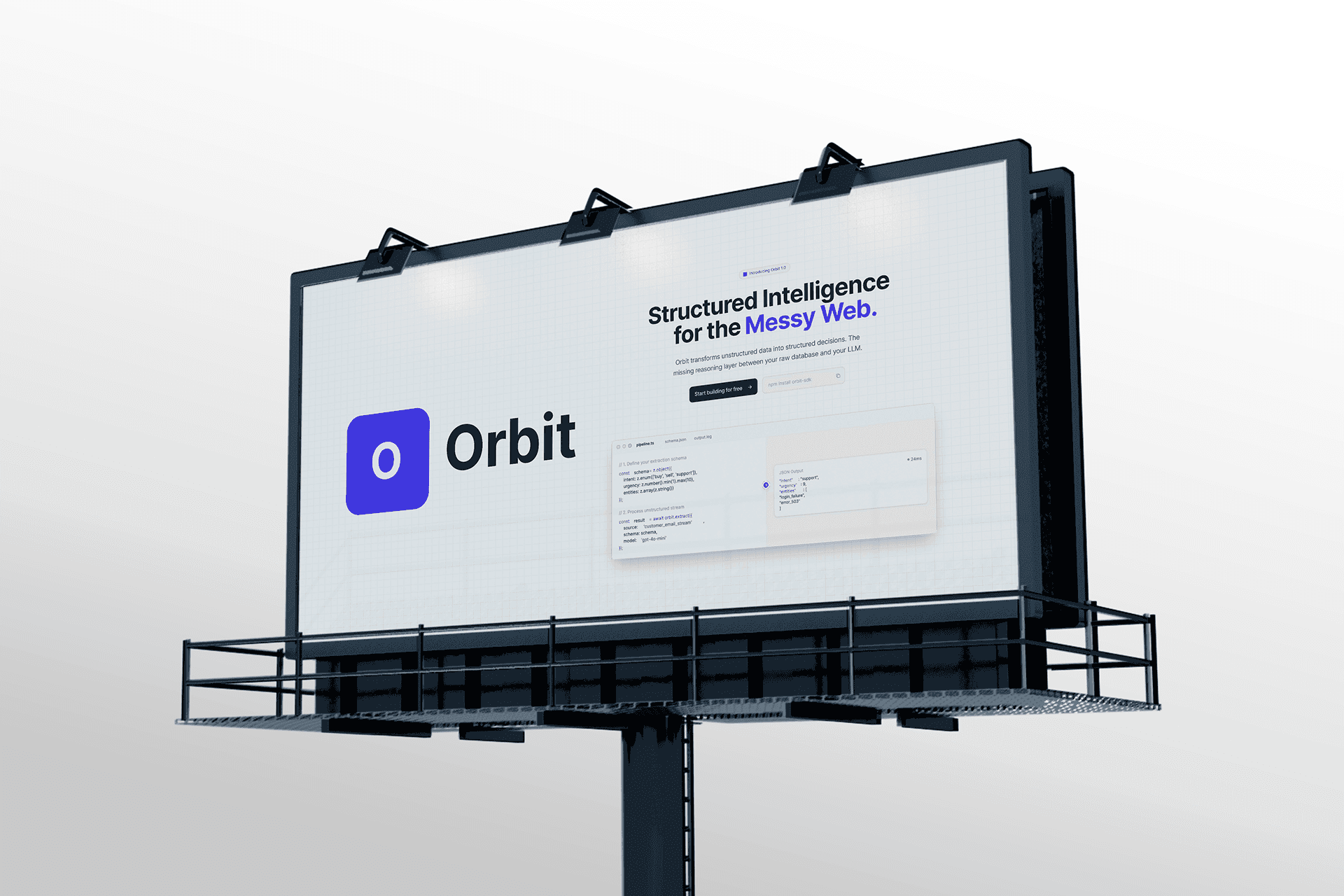
Orbit is built around a single adaptive timeline instead of separate task and calendar views. At the top, you define what this week is for: shipping a feature, closing a round, onboarding a client. Underneath, Orbit pulls in events, tasks, and deadlines from connected tools, then groups them into “orbits” — focused blocks that have a clear intention, owner energy level, and time boundary.
The core interaction is deliberately simple: accept, nudge, or swap proposed orbits. The UI uses a dark, cinematic theme with high contrast and minimal chrome so the only color comes from what matters now. AI suggestions are presented as quiet proposals, not interruptions: “Move this call to tomorrow, protect this 90-minute focus orbit, and cluster your admin work into one block.” I designed a reusable component system so the same patterns work across desktop planning and a lightweight mobile companion for in-the-moment decisions.
Outcomes and Learnings
Orbit validated a pattern I kept seeing in real teams: people do not need another place to dump tasks; they need help deciding what not to do today. In user walkthroughs, founders consistently reacted less to the AI label and more to the feeling of, “This finally matches how my week actually works.” Even as a concept, Orbit became a strong artifact for conversations around constraint-led planning and how to make AI feel like a calm scheduler rather than an over-eager assistant.
The project sharpened a few principles I now bring into work with clients: always design time-based tools around tradeoffs, never show more than one decision at once, and use dark UI not as an aesthetic gimmick but as a way to make priorities visually undeniable. Orbit sits in my portfolio as an exploration of what a truly opinionated, AI-native focus OS could look like for people who are already at capacity.
Problem
Most productivity stacks look impressive in screenshots and chaotic in real life. Founders juggle a calendar app, task manager, CRM, and half a dozen docs, but none of them agree on what today should actually look like. Calendars get filled with reactive meetings, tasks live in endless backlogs, and “deep work” becomes something you schedule aspirationally and then cancel.
Orbit was my attempt to answer a simple question: what would your day look like if a tool understood both your constraints and your priorities, and ruthlessly protected the time you actually need to think?
Product and Experience
Orbit is built around a single adaptive timeline instead of separate task and calendar views. At the top, you define what this week is for: shipping a feature, closing a round, onboarding a client. Underneath, Orbit pulls in events, tasks, and deadlines from connected tools, then groups them into “orbits” — focused blocks that have a clear intention, owner energy level, and time boundary.
The core interaction is deliberately simple: accept, nudge, or swap proposed orbits. The UI uses a dark, cinematic theme with high contrast and minimal chrome so the only color comes from what matters now. AI suggestions are presented as quiet proposals, not interruptions: “Move this call to tomorrow, protect this 90-minute focus orbit, and cluster your admin work into one block.” I designed a reusable component system so the same patterns work across desktop planning and a lightweight mobile companion for in-the-moment decisions.
Outcomes and Learnings
Orbit validated a pattern I kept seeing in real teams: people do not need another place to dump tasks; they need help deciding what not to do today. In user walkthroughs, founders consistently reacted less to the AI label and more to the feeling of, “This finally matches how my week actually works.” Even as a concept, Orbit became a strong artifact for conversations around constraint-led planning and how to make AI feel like a calm scheduler rather than an over-eager assistant.
The project sharpened a few principles I now bring into work with clients: always design time-based tools around tradeoffs, never show more than one decision at once, and use dark UI not as an aesthetic gimmick but as a way to make priorities visually undeniable. Orbit sits in my portfolio as an exploration of what a truly opinionated, AI-native focus OS could look like for people who are already at capacity.